As far as old hockey logos go, the Vancouver Canucks’ “flying skate” logo might be one of the most divisive of them all. Was this actually a logo good enough to warrant a rebirth, or are we simply hitting the member berries a little too hard again? (‘Member member berries?)
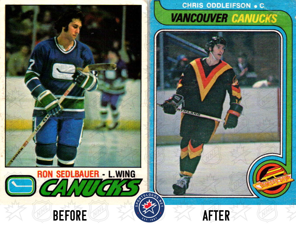
With its sharp lines, vibrant red-and-yellow colour palette, and a sense of speed woven into its look, it was a vast departure from the club’s previous blue-and-green hockey stick design when it was introduced in 1978. It was also the most visible element for one of the most memorable runs in franchise history when they went all the way to Game 7 of the 1994 Stanley Cup Final. Though they fell just short of ultimate glory, the love for the logo lives on, guaranteed to instantly bring back memories of that team that was just a win away.
As the ’94 team celebrates its 30th anniversary—and as the flying skate continues to make its mark now as an incredibly popular alternate jersey—let’s take a closer look at the origins of the flying skate logo and that colour scheme: how they came to be, their controversial reception, and how they have cemented their place in Vancouver’s visual identity.

When the Canucks decided to overhaul their look in 1978, they turned to Beyl and Boyd, a San Francisco-based design agency, to create a bold and aggressive new identity. The result was a massive shift from the team’s look up until that point—gone were the blue and green of the original uniforms, replaced by a vibrant red, orange, yellow, and black colour scheme meant to evoke energy and aggression.
“The Canucks colours were all wrong,” designer Bill Boyd told the Vancouver Sun in 1978. “Blue-green is the coolest colour of all; [it] slows the pulse, reduces aggression, and promotes calmness. With the [new] Canucks uniforms, we are going from the coolest of colours—blue-green—to the hottest—red-orange. The cool colour is passive, the hot one aggressive, plus the black. It’s the contrast of colours that creates emotion.”
This aggressive new palette was paired with a dynamic new logo by illustrator Mike Bull. The flying skate design replaced the stick-in-rink logo, which Boyd and his team considered too static for the fast-paced game of hockey. The skate, speeding diagonally across the word “Canucks,” embodied motion, style, and progress.

According to Boyd, the new logo was specifically chosen for its positive attributes of “movement and style,” reflecting the Canucks’ desire to inject energy and aggression into their brand. The change was as symbolic as it was visual, trading one piece of hockey equipment (the stick) for another (the skate) in a way that underscored the true speed of the game. It bore the hallmarks of the pop art movement, with sharp angles and a bold, contrasting colour palette. It was part of a broader trend in the late 1970s, as sports teams experimented with their aesthetics to stand out in increasingly competitive markets.
Initially, the Flying Skate’s impact on the uniforms was minimal, appearing only on the sleeves of the jersey and serving as a secondary element to the far more overpowering “V” design on the chest—a representation of the City of Vancouver.
“Diagonal stripes get your attention. They’re like the crooked picture on the wall. You have to fix it, or it drives you crazy,” Boyd explained. The Canucks continued to break from tradition by wearing yellow jerseys at home instead of white, with Boyd emphasizing, “White produces no response at all, so we went for yellow… Yellow is warm, pleasant, happy, upbeat.”

As with most bold design choices, the look proved polarizing. Critics mocked the new uniforms, with The Financial Post joking, “So the Canucks will go from ‘cool’ to ‘hot’ just by changing their uniforms? The rest of the teams could wear sunglasses, that is, if they aren’t already colourblind.”
By 1982, the Canucks had made a surprise run to the Stanley Cup Final, providing the flying skate logo with its first big moment on the national stage. Unfortunately, the New York Islanders quickly swept aside the team and eventually the “V” jerseys. Just three years later, the Canucks updated their look, moving the flying skate logo from the sleeves to the front of the jersey while shifting the “V” to the shoulders. These changes introduced a cleaner, more traditional uniform layout, though the colour scheme of red, yellow, and black remained intact.

By the late 1980s, dissatisfaction with the team’s look persisted. Brian Burke, the Canucks’ director of hockey operations at the time, criticized the jerseys on a local radio show, calling the home uniforms a shade of “puke-yellow.” His remarks inspired a 20-year-old fan named Jeremie White to propose a new uniform concept, pitching designs that replaced the colour scheme with black and blue and introducing a new design featuring a hockey stick flying through a “V.”
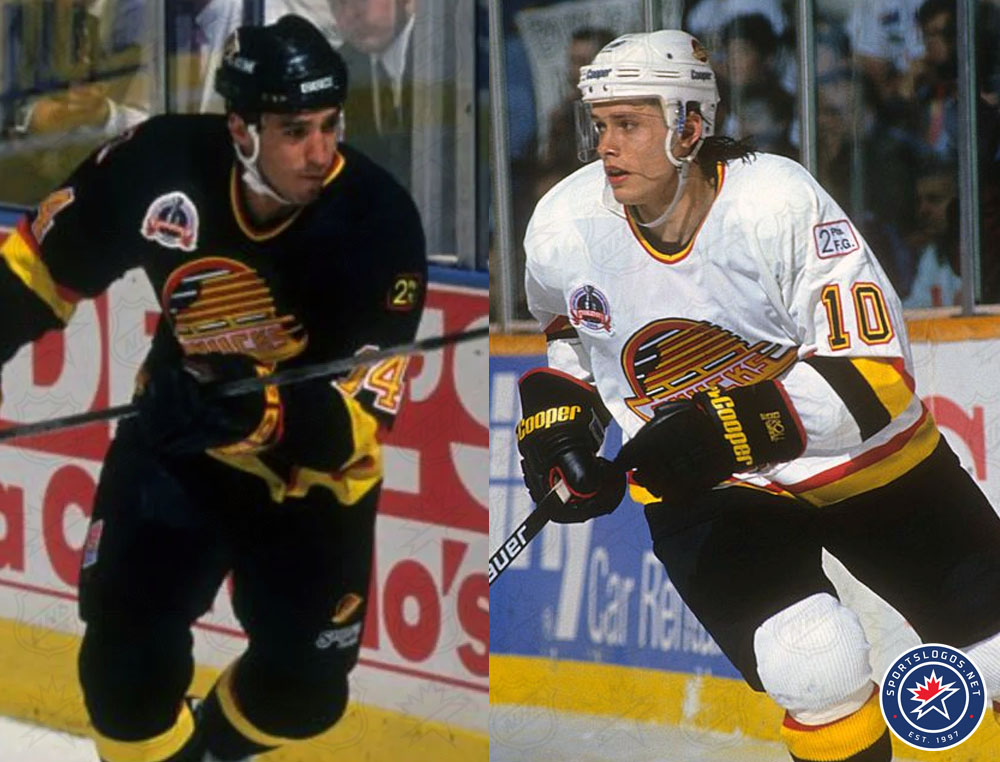
While Burke dismissed the colour and logo change, he saw potential in White’s skills and ideas. Partnering with general manager Pat Quinn, White refined the design, resulting in a significant uniform update in 1989. The new look eliminated the shoulder “V”s, reintroduced traditional striping on the jerseys, and replaced the “puke yellow” home uniforms with a white set. The flying skate logo remained front and centre on the chest of both the home white and road black sweaters. White’s vision, combined with Quinn’s leadership, ultimately helped refine the look that became synonymous with the Canucks’ most competitive teams of the ’90s.

The flying skate logo undoubtedly reached its peak during the 1994 Stanley Cup Final, where it adorned the jerseys of a gritty Canucks team led by Trevor Linden, Pavel Bure, and Kirk McLean. Though it ended in heartbreak, the flying skate became synonymous with that era of Canucks hockey and a moment when many younger fans forged their lifelong love for the team.
The popularity of that team wasn’t enough to stop the radical design shift the sports world experienced in the mid-to-late 1990s. Just three years later, it was gone, replaced with a new orca-focused logo and then, eventually, a return to that cool-and-calming blue and green colour scheme.
‘Member blue and green?
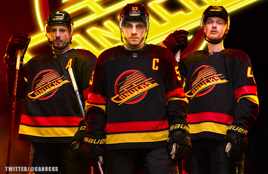
Despite its forced retirement, the flying skate’s popularity endured. While the orca logo ushered in a new chapter for the Canucks, many fans saw it as a corporate pivot—a sharp departure from the community-driven passion the flying skate represented. In 2019-20, as part of the team’s 50th-anniversary celebrations, the Canucks wore the flying skate jerseys for select games before bringing it back as a full-fledged third jersey during the 2022-23 season.

They say sometimes you have to lose something to love something, and that appears to be the case here with the Flying Skate logo. Widely panned in its day, the Flying Skate is now more popular than ever, with fans often pleading for it to return full-time, hoping to join a handful of other NHL teams that have corrected their ’90s redesigns.
As a hockey fan who grew up watching those black, red, and gold Canucks teams, I never got the appeal of that look at the time, but I can’t deny the warm-and-fuzzies I feel whenever I see them hit the ice today. It’s not just about the bold colours or sharp lines—it’s about the grit of Trevor Linden, the jaw-dropping magic of Pavel Bure, and the electric atmosphere of the old Pacific Coliseum every time the team stepped on the ice in that unforgettable outfit.
‘Member Gino Odjick?
Of course you do.
For a look at the all-time Canucks’ logo and uniform history, check out our complete collection here.
Get your own “Flying Skate” Canucks jerseys, shirts, and more here
